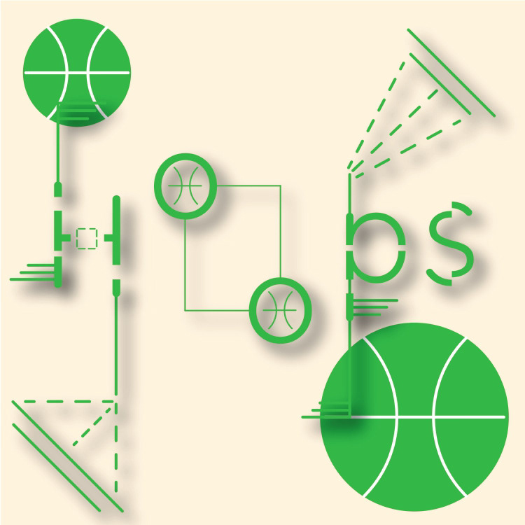
“Hoops” was a type design exercise where I challenged myself to experiment visually by creating an iconic type system using just one word. I chose “Hoops” because it connects strongly to basketball culture—socially, it often means something like, “Let’s go shoot some hoops outside.” That phrase reflects an experience I grew up with while watching and enjoying basketball.
After exploring multiple iterations and design directions, this version proved to be the most successful. The parallel symmetry of the two “o’s” suggests a sense of fluid motion. The overall design works well because I intentionally sliced each letter using Illustrator’s Pathfinder tools, giving the characters a strange yet compelling visual quality.